
Related Articles



Today, most people use their smartphones to browse websites, read articles, shop online, watch videos, and search for information. Because of this, making a website mobile friendly is no longer something that website owners can ignore. In my experience, a website may look perfect on a desktop computer, but if it is difficult to use on a phone, visitors can quickly leave.
A mobile friendly website adjusts its layout, text, images, buttons, and other elements so they work properly on smaller screens. The goal is simple. Visitors should be able to open your website on a smartphone and use it comfortably without zooming in, scrolling sideways, or struggling to click buttons.
In this guide, I will explain how to make a website mobile friendly and share practical methods that can improve both user experience and SEO.
What Does Mobile Friendly Mean?
A mobile friendly website is designed to work properly on smartphones and tablets. The content should automatically adjust according to the screen size.
For example, a desktop website may display three columns of content. On a smartphone, those columns should normally stack vertically so visitors can read everything without horizontal scrolling.
Mobile friendliness also means that menus should be easy to open, buttons should be easy to tap, images should fit the screen, and text should remain readable.
I believe the best mobile design is one that does not make visitors think about the design at all. Everything should feel natural and easy to use.
Use Responsive Web Design
One of the most important steps to make a website mobile friendly is using responsive web design.
Responsive design allows your website layout to automatically adjust to different screen sizes. Instead of creating a completely separate website for mobile users, your existing website can respond to the device being used.
A responsive website can change the width of sections, resize images, rearrange columns, and adjust navigation depending on the screen size.
If you are using WordPress, many modern themes already include responsive design. However, I still recommend testing the website yourself because a responsive theme does not automatically guarantee that every element will work perfectly on mobile devices.
Choose a Mobile Friendly WordPress Theme
If you are building a WordPress website, your theme has a major effect on mobile performance.
When choosing a WordPress theme, look for a clean layout, responsive design, simple navigation, readable typography, and good performance. Avoid themes that include too many unnecessary visual effects and features.
A website does not need to look complicated to look professional. In my opinion, a simple design is often better because visitors can quickly find the information they need.
Before choosing a theme, check how it looks on different screen sizes. Pay special attention to the homepage, blog posts, menus, buttons, forms, and footer.
Make Your Website Load Quickly
Website speed is especially important for mobile users. People browsing on phones may be using mobile data or a slower internet connection. If your website takes too long to load, visitors may leave before seeing your content.
To improve mobile website speed, start by optimizing your images. Large image files can consume a significant amount of loading time.
You can compress images before uploading them and use modern image formats when appropriate. You should also avoid uploading unnecessarily large images when a smaller version would look just as good.
Caching, efficient hosting, optimized code, and fewer unnecessary plugins can also help improve loading speed.
I always recommend checking the website after making speed improvements rather than assuming that an optimization worked. A faster website should be tested on both desktop and mobile devices.
Optimize Images for Mobile Devices
Images are important for making content attractive, but large images can create problems for mobile users.
Always make sure your images fit naturally inside the content area. A picture should not extend beyond the screen and force visitors to scroll horizontally.
Use suitable image dimensions and compress files before uploading them. Also, add descriptive alternative text to important images. Alt text can improve accessibility and helps search engines understand what an image represents.
Another useful practice is lazy loading. With lazy loading, images that are not immediately visible can load when visitors scroll closer to them. This can reduce the amount of content that needs to load immediately.
Make Text Easy to Read
Readable text is one of the most important parts of mobile friendly design.
If the font is too small, visitors have to zoom in. If paragraphs are too wide or crowded, reading becomes uncomfortable.
Use a clear font with an appropriate size and enough spacing between lines. Break long sections into smaller paragraphs and use headings to organize your content.
For blog posts, I prefer short paragraphs because they make articles much easier to read on smartphones.
You should also create a clear visual difference between headings, subheadings, normal text, and important information. This helps visitors scan your article quickly.
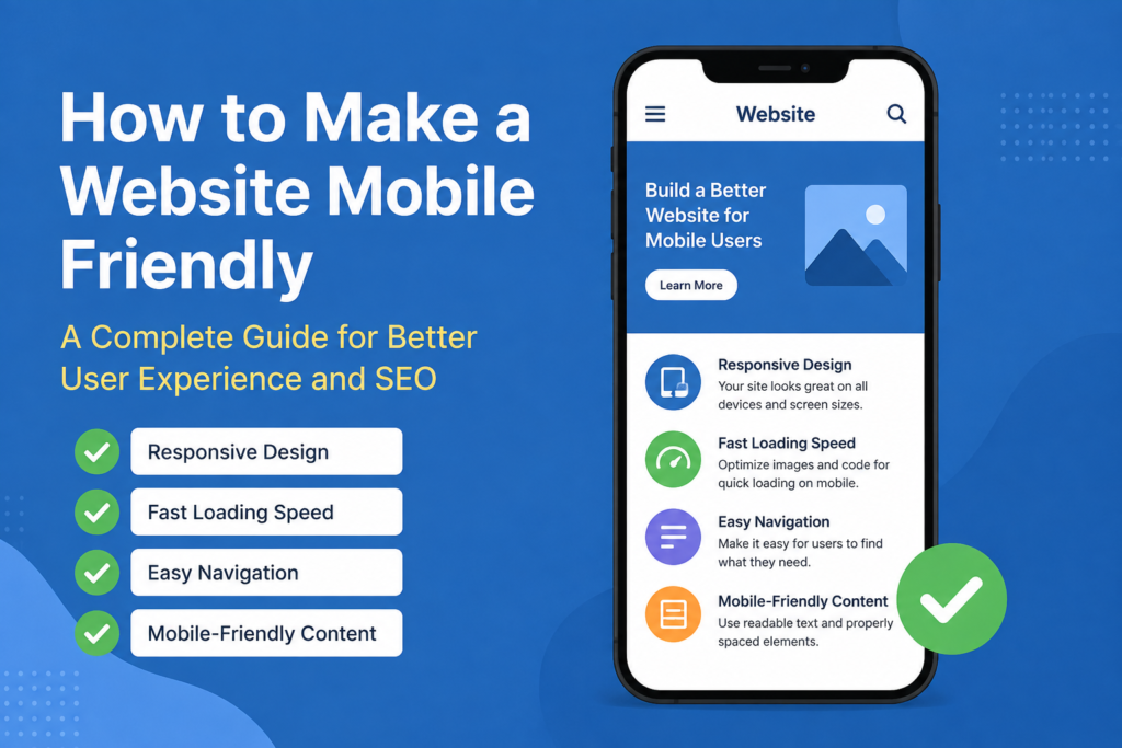
Create Simple Mobile Navigation
Navigation can become difficult when a desktop menu contains many links.
On mobile devices, a large navigation menu can take up most of the screen. A simple mobile menu is usually a better solution.
Use a recognizable menu button and organize your main pages logically. Visitors should be able to find important sections without opening several confusing menus.
For example, a basic website might include Home, About, Services, Blog, and Contact. There is usually no reason to put dozens of links in the main mobile navigation.
Good navigation improves the overall user experience and helps visitors discover more pages on your website.
Make Buttons Easy to Tap
Buttons and links should be comfortable to use on a touchscreen.
If several links are placed too close together, visitors may accidentally tap the wrong one. This is particularly frustrating on smaller smartphones.
Give buttons enough space around them and make sure important calls to action are easy to identify.
For example, buttons such as Contact Us, Buy Now, Read More, or Subscribe should be clearly visible and easy to tap.
You should also make sure buttons do not become too small when the website changes to a mobile layout.
Avoid Horizontal Scrolling
One of the clearest signs that a website is not mobile friendly is horizontal scrolling.
Visitors should normally be able to read your content by scrolling vertically. If they have to move the screen from left to right to see a sentence, image, or button, something needs to be fixed.
Horizontal scrolling can happen because of oversized images, tables, fixed width sections, large advertisements, or poorly designed elements.
After making changes to your website, open it on a smartphone and check every section. Make sure nothing extends outside the visible screen.
Keep Popups Under Control
Popups can be useful for email subscriptions, announcements, promotions, and other purposes. However, too many popups can make a mobile website difficult to use.
On a small screen, a popup can cover almost the entire page. If visitors cannot easily close it, they may leave the website.
Use popups carefully and make sure the close button is visible and easy to tap. The main content should remain accessible.
For an AdSense friendly website, it is also important to maintain a good balance between advertisements and useful content. Ads should not make the website difficult to navigate or read.
Test Your Website on Different Devices
One of the easiest ways to discover mobile problems is to test your website yourself.
Open your website on different smartphones and tablets if possible. Check the homepage, articles, menus, images, forms, buttons, and contact pages.
Do not only check whether the website opens. Actually use it like a normal visitor.
Try opening the menu. Read an article. Click internal links. Fill out a form. Search the website. Scroll through the page.
This type of testing can reveal problems that are difficult to notice when looking at the website from a desktop computer.
Improve Mobile SEO
Mobile friendliness is also closely connected with SEO.
Search engines want to provide users with useful and accessible websites. A website that works well on mobile devices can provide a better experience for visitors.
Your SEO strategy should therefore consider mobile users from the beginning.
Use clear headings, descriptive page titles, readable content, optimized images, internal links, and fast loading pages. Make sure important content is available on the mobile version of your website.
Avoid hiding useful information from mobile visitors simply to make the page shorter. Mobile users should still have access to the important content they need.
Remove Unnecessary Elements
Another effective way to make a website mobile friendly is to simplify it.
Look at your website and ask yourself whether every element is necessary.
Do you really need several large banners? Are all your plugins useful? Does every sidebar widget provide value? Are there unnecessary animations that slow down the page?
Removing unnecessary elements can make the website cleaner and faster.
In my opinion, mobile design is often about choosing what not to include. A simple website with useful content can provide a much better experience than a complicated website filled with distracting features.
Make Forms Mobile Friendly
Forms are often overlooked when optimizing a website for smartphones.
If you have a contact form, newsletter form, registration form, or checkout form, make sure it works comfortably on smaller screens.
Input fields should be large enough to tap and easy to understand. Keep the number of required fields reasonable.
If a visitor has to complete a long and complicated form on a phone, there is a greater chance that they will abandon it.
A simple mobile form can improve conversions and make communication easier.
Check Your Website Regularly
Mobile optimization is not a one time task.
Websites change over time. You may install a new plugin, change your theme, add advertisements, upload a new image, or create a new page. Any of these changes can create mobile problems.
That is why I recommend checking your website regularly.
Whenever you make a major design or plugin change, open the website on a smartphone and test it again. Regular testing can prevent small problems from becoming bigger usability issues.
Final Thoughts
Learning how to make a website mobile friendly is one of the most useful things a website owner can do today. A good mobile website should be responsive, fast, readable, easy to navigate, and comfortable to use.
Start with responsive design and a suitable WordPress theme. Then optimize images, improve loading speed, simplify navigation, make buttons easy to tap, and remove unnecessary elements. Do not forget to test forms, advertisements, menus, and content on actual mobile devices.
From my point of view, the best mobile friendly website is not necessarily the most complicated one. It is the website that allows visitors to find information quickly and complete their goals without frustration.
If your website works smoothly on smartphones, you are not only improving user experience. You are also creating a stronger foundation for SEO, engagement, and long term website growth.
A mobile friendly website is therefore not just a design improvement. It is an important part of building a useful, accessible, and successful website.