
Related Articles

A website navigation menu may look like a small part of a website, but in my opinion, it is one of the most important elements of a good website. When visitors arrive on a website, they should quickly understand where they are and where they can go next. A clear navigation menu helps them find important pages without confusion.
I have found that a simple website navigation menu is usually better than a complicated one. Website owners sometimes try to place too many links in the menu because they want visitors to see everything. However, this can make the website look crowded and difficult to use.
In this article, I will explain how to create a simple website navigation menu, what pages you should include, how to organize your links, and how to make your navigation menu useful for both visitors and search engines.
What Is a Website Navigation Menu?
A website navigation menu is a collection of links that helps visitors move from one page to another. It is usually placed at the top of a website, although some websites also use navigation menus in sidebars or footers.
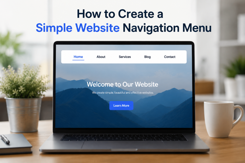
A basic website navigation menu may include pages such as Home, About Us, Services, Blog, and Contact Us.
The purpose is simple. Visitors should not have to search through your entire website to find an important page. Your navigation menu should give them a clear path.
For example, if I visit a website for the first time and see Home, About, Services, Blog, and Contact, I immediately understand the basic structure of the website. That is exactly what good navigation should do.
Why Website Navigation Is Important
Good website navigation improves the user experience. When visitors can easily find what they need, they are more likely to stay on the website and explore additional pages.
Poor navigation can have the opposite effect. If important pages are difficult to find, visitors may leave the website even if the content itself is useful.
Navigation can also support search engine optimization. Search engines use links to understand the structure and relationship between different pages on a website. A logical internal linking structure can make it easier for search engines to discover and understand your content.
From my point of view, navigation should always be designed for people first. When visitors can use your website comfortably, many other website benefits can follow naturally.
Start With Your Most Important Pages
Before creating your navigation menu, make a list of the most important pages on your website.
For a simple website, you may only need five or six main links. Common options include:
Home
About Us
Services
Blog
Contact Us
Privacy Policy
Depending on the purpose of your website, you may need different pages. An online store could include Shop, Categories, Cart, and Account. A portfolio website could include Portfolio, Projects, About, and Contact.
The important thing is not to add every page to the main menu. Choose the pages that visitors are most likely to need.
Keep the Navigation Menu Simple
One of the easiest ways to create a better navigation menu is to keep it simple.
A visitor should be able to look at your menu and understand it within a few seconds. If your menu contains fifteen or twenty links, it may become difficult to scan.
I recommend starting with the essential pages and adding more links only when they are genuinely useful.
For example, a small business website might use:
Home
About
Services
Blog
Contact
This structure is simple, professional, and easy to understand.
You can place less important links in the footer instead of adding everything to the main navigation menu.
Use Clear Navigation Labels
The words you use in your navigation menu matter. Visitors should understand what they will find after clicking a link.
For example, About is generally easier to understand than Our Story and Information Center. Similarly, Contact is usually clearer than Get In Touch With Our Team.
This does not mean creative labels are always wrong. They can work for some brands. However, clarity should come first.
When creating a navigation menu, I prefer short and familiar words. Clear labels reduce confusion and make the website easier for everyone to use.
Put the Navigation Menu in a Familiar Location
Most websites place their main navigation menu at the top of the page. This is useful because visitors are already familiar with this layout.
The logo is often placed on the left side, while the navigation links appear beside it or toward the right side.
Keeping the menu in a familiar location makes your website easier to understand. Visitors do not need to learn a new system just to move around your pages.
You can also include a navigation menu in the footer. The footer menu can contain additional links such as Privacy Policy, Terms and Conditions, Disclaimer, Sitemap, and other useful pages.
Make Your Navigation Mobile Friendly
Today, many people browse websites using smartphones. This means a navigation menu should work properly on small screens.
A menu that looks perfect on a desktop computer may become difficult to use on a phone. Links can become too close together, text can become too small, and the menu can take up too much space.
For mobile websites, many designers use a menu button that opens the navigation links when tapped. This is often called a mobile menu or hamburger menu.
The exact design is less important than usability. Visitors should be able to open the menu easily, understand the available options, and return to the page without difficulty.
Always test your website on an actual phone before considering the navigation finished.
Create a Logical Page Structure
A good navigation menu should reflect the structure of your website.
For example, imagine you have a website about blogging. Your main menu could contain:
Home
Blog
Blogging Tips
Website Setup
SEO
About
Contact
If you have many categories, you can organize them under a suitable parent menu item. This prevents the main navigation area from becoming too crowded.
However, dropdown menus should be used carefully. If every menu item has multiple levels of dropdowns, visitors may struggle to find what they want.
A simple structure is usually easier to manage and easier for visitors to understand.
Use Dropdown Menus Carefully
Dropdown menus can be useful when a website has many related pages. For example, an online store may have a Shop menu containing different product categories.
However, I would not recommend using dropdown menus just because they look professional.
Every additional layer adds complexity. If visitors need to move through several menus before reaching a page, the navigation experience can become frustrating.
Use dropdowns when they solve a real organizational problem. If you only have a few pages, regular navigation links are usually enough.
Make the Current Page Easy to Identify
A useful navigation menu should show visitors which page they are currently viewing.
For example, if someone is reading your About page, the About link can have a different visual appearance. This could be a different text color, underline, background, or another simple design feature.
This small detail can make navigation easier because visitors always know where they are within the website.
It is especially helpful on websites with many pages or categories.
Add Internal Links Within Your Content
Your main navigation menu is not the only way visitors can move around your website.
Internal links inside your articles can also help visitors discover related content.
For example, if I write an article about choosing a domain name and mention web hosting, I can link to another article about choosing web hosting.
This creates a useful connection between related articles. It can encourage visitors to read more content and can also help search engines understand your website structure.
The links should be natural and genuinely useful. Avoid adding links simply to increase the number of links on a page.
Think About SEO When Creating Navigation
A simple website navigation menu can also support SEO when it is properly organized.
Use descriptive page names and connect important pages through logical internal links. Make sure your navigation links lead to real, useful pages.
Avoid creating unnecessary pages just to fill the navigation menu.
Your navigation should help search engines understand which pages are important while also helping visitors move through the website.
In my opinion, there is no need to make navigation complicated for SEO. A clean structure with useful pages and relevant internal links is a much better approach.
Keep Design Consistent
Your navigation menu should match the overall design of your website.
Use fonts, spacing, and colors that fit your website style. Make sure the text is easy to read against the background.
The menu should also remain consistent across different pages. If the navigation changes completely from one page to another, visitors may become confused.
A consistent menu gives the website a more professional appearance and creates a smoother browsing experience.
Test Your Navigation Before Publishing
Before publishing your website, test every navigation link.
Click Home, About, Services, Blog, Contact, and every other important menu item. Make sure each link opens the correct page.
You should also test your navigation on different screen sizes. Check it on a desktop computer, tablet, and smartphone.
Look for broken links, overlapping text, difficult buttons, and menus that do not open correctly.
I believe this testing step is often ignored, especially by beginners. A navigation menu may look perfect while editing the website but behave differently after publication.
Common Website Navigation Mistakes
There are several mistakes I recommend avoiding.
The first is using too many links. A crowded menu can make the website difficult to understand.
The second is using unclear labels. Visitors should not have to guess what a menu item means.
The third is ignoring mobile users. A navigation menu that only works well on desktop computers is not enough.
Another mistake is hiding important pages. If a visitor needs to search through several pages to find your contact information, the website experience becomes less convenient.
Finally, avoid changing the navigation structure too often. Once visitors become familiar with your website, consistency makes browsing easier.
Final Thoughts
Creating a simple website navigation menu does not require complicated design or advanced technical knowledge. The main goal is to make your website easy to understand and easy to use.
Start by identifying your most important pages. Keep the number of main links reasonable, use clear labels, place the menu in a familiar location, and make sure it works properly on mobile devices.
You should also organize your pages logically and use internal links to connect related content.
From my point of view, the best navigation menu is one that visitors barely need to think about. They should arrive on your website, understand the available options, click the page they want, and continue browsing without confusion.
A simple website navigation menu can make a website look more professional, improve user experience, support your website structure, and help visitors discover more of your content. Whether you are building a personal blog, business website, portfolio, or informational website, investing time in clear navigation is always worthwhile.