
Related Articles
A Contact Us page is one of the most important pages on a website, but I have noticed that many website owners do not give it enough attention. They focus heavily on the homepage, blog posts, services, and product pages while treating the Contact Us page as something they can create quickly at the end. In my opinion, this is a mistake.
A good Contact Us page makes it easy for visitors to communicate with you. It can help build trust, answer basic questions, generate business inquiries, and give visitors confidence that there is a real person or team behind the website.
If you are creating a new website or improving an existing one, learning how to create a Contact Us page should be part of your basic website setup. The good news is that you do not need complicated design skills to create an effective contact page. You simply need clear information, a simple contact form, and an easy way for visitors to reach you.
Why a Contact Us Page Is Important
The main purpose of a Contact Us page is to give visitors a direct way to communicate with you. Someone may have a question about your services, want to report an issue, ask about a product, or simply want to share feedback.
Without a proper contact page, visitors may leave your website because they cannot find a way to contact you.
I believe a Contact Us page also makes a website look more professional. When visitors can easily find your email address, phone number, business information, or contact form, they are more likely to trust the website.
For business websites, a contact page can also become an important source of leads. A simple form can turn an interested visitor into a potential customer.
Start With a Clear Page Title
When creating your Contact Us page, start with a simple and clear title.
The most common choice is simply “Contact Us.” There is no need to create a complicated title that makes visitors wonder what the page is about.
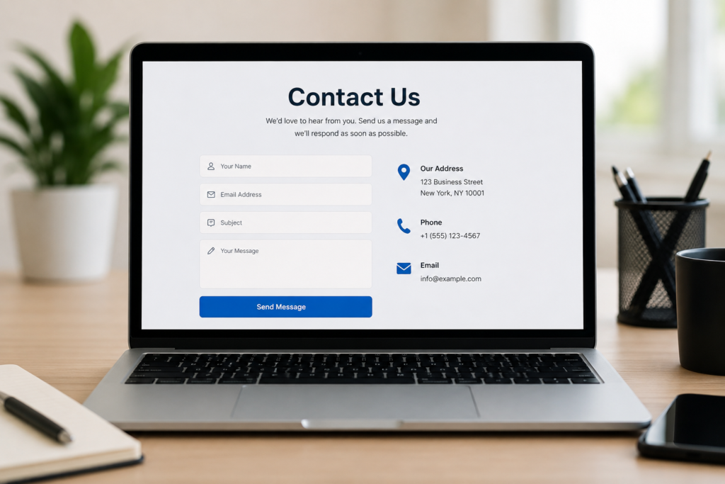
Under the title, you can add a short introduction. For example, you could write that you would be happy to hear from visitors and that they can use the form to send their questions.
The introduction should sound natural and welcoming. Instead of using complicated business language, I prefer simple sentences that make visitors feel comfortable contacting the website owner.
Add a Simple Contact Form
A contact form is one of the easiest ways for visitors to send a message. A good contact form should only ask for information that you actually need.
For a basic website, the form can include:
Name
Email address
Subject
Message
Submit button
That is usually enough.
I would avoid asking for too many details. If someone only wants to ask a simple question and your form asks for their address, phone number, company name, job title, and several other details, they may decide not to complete it.
A short and simple form usually provides a better user experience.
Use a Clear Submit Button
The submit button is a small part of the Contact Us page, but it still matters.
Use clear wording such as “Send Message” or “Submit.” The visitor should immediately understand what will happen when they click the button.
Avoid confusing words that do not explain the action.
The button should also be easy to see on both desktop and mobile devices. If the button blends into the background, visitors may not immediately notice it.
Add Your Email Address
Even if you have a contact form, I recommend adding a professional email address to the Contact Us page.
Some visitors prefer sending an email directly rather than filling out a form. Providing an email address gives them another option.
If you operate a business website, using an email address connected to your domain can look more professional than using a personal email account.
For example, an address such as info@example.com can make the website appear more established.
However, only publish an email address that you actually monitor. There is no benefit in giving visitors an address that you rarely check.
Include a Phone Number When Appropriate
If your website represents a local business or company that handles customer support by phone, you can also include a phone number.
Make sure the number is accurate and easy to read.
If you do not want to receive phone calls, there is no need to add a phone number simply because other websites have one. Your Contact Us page should reflect the communication methods that you actually provide.
For online blogs and small personal websites, an email address and contact form may be completely sufficient.
Add Business Information
For a business website, you may want to include important business details such as your business name, location, working hours, and other relevant information.
This can make it easier for customers to understand when and how they can reach you.
If your business has a physical location, you can also add a map when it genuinely helps visitors. A map can be particularly useful for restaurants, offices, shops, clinics, and other local businesses.
At the same time, avoid adding information that is unnecessary for your audience.
Make Your Contact Us Page Mobile Friendly
A large number of website visitors use smartphones, so your Contact Us page should work properly on smaller screens.
The form fields should be large enough to tap easily. Text should be readable without zooming. Buttons should be easy to press, and the page should not require visitors to scroll sideways.
I always recommend testing a contact page on both a computer and a smartphone before publishing it.
A page that looks perfect on a desktop computer can sometimes have problems on mobile devices. Testing helps you discover these issues before visitors do.
Keep the Design Simple
When it comes to a Contact Us page, simple design is usually better.
You do not need a page filled with animations, large graphics, or unnecessary elements. The main goal is to help visitors contact you quickly.
Use clear headings, enough spacing, readable text, and an easy to understand form.
You can also divide the page into sections. For example, the contact form can appear on one side while your email, phone number, and business information appear on the other side.
The exact design will depend on your website, but the basic principle is the same. Make contacting you easy.
Add a Helpful Introduction
A small introduction can make the page feel more personal.
Instead of immediately showing a form, you can write something like:
“Have a question or suggestion? We would love to hear from you. Send us a message and we will get back to you as soon as possible.”
You can adjust the wording according to your own website and personality.
Since I believe a website should sound like it is written by a real person, I would avoid overly formal language unless the website requires it.
Tell Visitors What Happens Next
One useful improvement is telling visitors what they should expect after submitting the form.
For example, you can mention that messages are usually answered within a certain period if you can realistically maintain that response time.
This helps manage visitor expectations.
Do not promise a response within a few hours if you know that you may take several days. Be honest about your expected response time.
You can also add a confirmation message after someone submits the form. A simple message thanking them for contacting you is enough.
Protect Your Contact Form
Security is another important part of creating a Contact Us page.
Forms can sometimes attract spam messages, so you should use reasonable spam protection. Depending on your website platform, you may have options for spam filters, verification tools, or other security features.
You should also make sure your website uses HTTPS. This helps protect information exchanged between visitors and your website.
Do not collect sensitive personal information through a basic contact form unless there is a clear reason and you have the appropriate security and privacy measures in place.
Connect the Form to Your Email
A contact form is only useful if you actually receive the messages.
After installing your form, send a test message to make sure everything works correctly. Check that the message reaches the correct email address and that the confirmation message appears properly.
This is something I strongly recommend doing before publishing the page.
It is frustrating for a visitor to spend time writing a message only to discover that the form does not work.
Add Your Contact Page to the Website Menu
Creating the page is not enough. Visitors need to be able to find it.
The Contact Us page should normally be linked from your main website navigation or footer.
Many websites place the Contact Us link in the top menu and footer. This gives visitors multiple ways to access it.
You can also link to your Contact Us page from relevant blog posts, service pages, and other areas where visitors may need assistance.
Create a Useful Contact Page for SEO
SEO is important, but the Contact Us page should primarily be designed for people.
Use a clear page title such as “Contact Us.” Write a short and useful description explaining how visitors can reach you.
If your business serves a specific location, you can naturally mention the relevant location in your content when appropriate.
Do not fill the page with keywords simply to increase search rankings. Keyword stuffing can make the content look unnatural and reduce the quality of the page.
A useful Contact Us page should focus on clarity, trust, and accessibility.
Make Your Contact Us Page Trustworthy
Trust is one of the biggest reasons to have a professional Contact Us page.
Visitors are more comfortable contacting websites that clearly explain who they are and how they can be reached.
Depending on your website, you can connect your Contact Us page with your About Us page, privacy policy, terms and conditions, and other important pages.
For a business website, consistent business information across the website can also make the overall site look more reliable.
Common Contact Us Page Mistakes
There are several mistakes I would avoid when creating a Contact Us page.
The first is making the form too complicated.
The second is hiding the Contact Us link where visitors cannot find it.
The third is publishing an email address that nobody checks.
Another common mistake is failing to test the form.
I would also avoid using too much unnecessary text. Visitors usually come to a Contact Us page because they want to contact you. They should not have to read a long introduction before reaching the form.
Final Thoughts
Learning how to create a Contact Us page is not difficult, but creating a useful one requires some thought. In my opinion, the best Contact Us pages are simple, clear, trustworthy, and easy to use.
Start with a clear Contact Us heading and a short friendly introduction. Add a simple contact form with only the fields you need. Provide your email address and phone number when appropriate. Include business information if it is useful to your visitors, and make sure the entire page works properly on mobile devices.
Most importantly, test your contact form before publishing the page.
A Contact Us page may look like a small part of a website, but it can have a big impact on communication, trust, and potential business opportunities. If you make it easy for people to reach you, you are already improving the overall experience of your website.
For me, the goal is simple. When a visitor opens the Contact Us page, they should immediately understand how to contact me and feel confident that their message will reach a real person. That is what makes a Contact Us page genuinely useful.